
As people rely on mobile devices more, businesses must decide if they want a mobile app or a responsive website. This blog post will discuss responsive web design and why it is a better option for your business than creating a separate mobile app.
Understanding Responsive Web Design
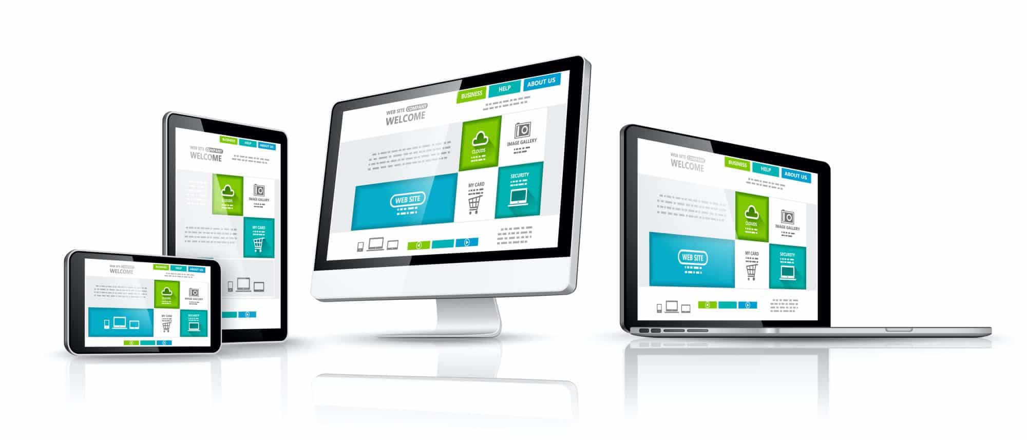
Responsive web design is an approach to web development that aims to make web pages render well on a variety of devices and screen sizes. It involves creating websites that automatically adjust their layout and content to fit the screen they are viewed on, whether it’s a desktop monitor, tablet, or smartphone.
Key features of responsive web design include:
Fluid Grid Layout: Elements on the webpage are sized using relative units (like percentages) rather than fixed units (like pixels), allowing them to adapt to different screen sizes.
Flexible Images: Images are scaled proportionally to fit the screen without losing quality or breaking the layout.
Media Queries: CSS media queries are used to apply different styles or rules based on the device’s characteristics, such as screen width.
Optimizing the user experience for smaller screens is ensured by designing for mobile devices first, which is the Mobile-First Approach..
Why Responsive Web Design Is Better Than an App
While mobile apps have their merits, responsive web design offers several advantages that make it an interesting choice for businesses:
- Cost-Efficiency:
Developing and maintaining a mobile app can be expensive. It requires separate versions for different platforms (iOS, Android) and continuous updates. Responsive web design, on the other hand, provides a cost-effective solution as you maintain one website for all devices. - Wider Reach:
Mobile apps require users to download and install them. With responsive web design, your content is accessible to anyone with an internet connection and a web browser. This broader reach can be especially valuable for reaching new audiences. - Instant Updates:
They can update Web content in real-time, ensuring that users always have access to the latest information. Users may find it frustrating to download and install new versions of apps, which can cause version fragmentation. - SEO-Friendly:
Search engines favor responsive websites because they provide a consistent user experience across devices. Responsive design makes it easier for your site to rank well in search engine results. - Cross-Platform Compatibility:
A responsive website works seamlessly on various devices and operating systems. It can be complicated and take a lot of time to make separate apps for various platforms. - Lower Barrier to Entry:
Users can access your content without the need for downloads or app store approvals. This can lead to higher user engagement, especially for businesses targeting a diverse audience. - Improved Analytics:
Responsive web design allows you to track user behavior and engagement more easily through web analytics tools, providing valuable insights for optimizing your content and user experience.
Conclusion
Responsive web design is a budget-friendly and user-friendly solution that often surpasses mobile apps in terms of reach and adaptability. While apps remain a valuable choice for certain scenarios, many businesses decide on responsive web design to provide a seamless and inclusive user experience across all devices. Responsive design ensures your audience gets what they need without restrictions.